Sunday, 28 March 2010
The media institution I might let distrubte my media product is GMG. (Guardian Media Group plc). This insitution has vast amounts of subsituaries which include magzine, radio and newspapers like the guardian and the Observer. I would choose this insititution to distrubte my media product because of their experience marketing to niche audiences. I have a media product that caters to a niche market. Through radio stations that GMG own like Smooth Radio and Jazz FM( which my audience will listen to) and newspapers they read like broadsheet newspapers like the Guardian instead of tabloids newspapers like The Sun and News of the World. The audience would already know this company and would make the link that if their radio stations and newspapers which they consume are good then these positive connotations will be linked to my magazine. Also, my magazine fits into GMG product portflio. As GMG generally have products that my target audience are interested in; they would know how to promote my product as they have the same market segment and do it successfully. For this reason is mainly why I choose GMG as the media insititution to distrubte my product instead of one of the bigger, well known publications like IPC because they may not know how to target my segment successfully especially as it is a market niche and they cater for mainstream audiences.
I order to know how successful my magazine is I have asked people of their opinion of the magazine as a whole.
PERSON 1: With this person's feedback, I bullet pointed topics that she could discuss in order to prompt her and get her started. These bulletpoint topics included:
- The colour scheme
- The Layout
- How the genre is conveyed
PERSON 2: This person I never prompted as she didn't need to and she talked freely.

Friday, 26 March 2010
Now I have done the article for my magazine. I can begin to concertrate on the layout of the magazine to make it look like a real magazine.
On my double page spread there is no title but this is because on the previous page there will be a title saying "The dream starts now" on it with a summary which is similar to the Vibe magazine article that I analysed. By doing this there will be more space for copy and addtional imagery on the double page spread but also provides intertextuality by making a link between the pages/continuity throughout the article.
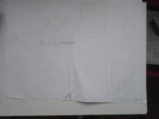
Here is the layout plan for my double page spread. I have included conventions that make it an article like floating quotes and additional imagery. For this layout, I have used the vibe magazine double page spread as an inspiration but made it more simplistic; keeping with the style and characteristics of Smooth Magazine.
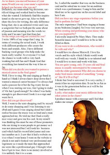
Chantrey, the new upcoming artist, is a 23-year old singer born in London but found in Brownsville, Texas is ready to dominant the soul charts. Discovered through singing in the state shopping mall, she is read to show the world what she has to offer and wants to give it her all. her debut single "Sacrifice" already reached no.1 in the Billboard 100 charts and now with the release of her debut album "This is Chantrey" whicch is being released on the 23rd september 2010, she is prepared to show the world who she is.
Where did your love for soul music come from?
It started when I was a kid. My parents used to listen to all the soulful greats of our time like James Brown and Ray Charles and that really gave me a thrist, hunger and passion for soul music as well as it being calm and mellow. I want to create music that also glorifies God and what better way to do that than through the Soul genre. So what i do is take a message and make it into proper love music because that is what soul music is all about. Love Music,Love Soul.
That's a nice motto
Yeah. When I make my music I always think of that motto.
I know that you moved from London to America but when did you move and how did you decide it was the right time?
I actually didn't make that decision [laughs].When I was 14 my mum decided to move our family to texas because she had a job offer at a fashion magazine so she took the offer. She always has a love for writing and she wanted to make it as an editior and that was a great opportunity for her and I couldn't let her refuse the offer; so we all made the choice to let go and leave our home in London so my mum could fulfill her dreams.
What do you miss the most about London?
It would have to be fish and chips. You can't get that where I live now.
Your early life is quite interesting. how was it like growing up for you?
Well, i was born in Wembley, North West London to a working class family. My mother raised me and my brother from when I was bout six as my father left us. It's quite emotional but urmm he said to me that he was just leaving to go "out" and he never came back.
But now he is back in your life?
Yeah. We reunited recently.
How did that come about?
Well, I was really determined to find him but I had no money to hire a private investigator or anything like that so quite recently actually, I Google searched his name, just to see what would happen. I wasn't expecting anything meaningful to happen but I found his Facebook profile and then I added him. So now ew are making up for lost time and I thank God that I found him.
As we know now that you moved because of your mum, Would you say that your mum's aspirations helped you to become who you are?
Definitely, my mum made big decisions, sacrificed things and worked hard to become what she wanted. I definitely find this inspirational as he never gave up. Also we both share this love for writing, the only difference being that; she is an editorial writer and I am a songwriter but weboth put the same about of passion and meaning into the words we write and I'm sure I got that from her.
So the songs you sing are created by you?
I write 100% of my songs that I sing. In terms of creating the actual track, I work with different producers who create the beats and sounds. Also,I have different backing vocal groups who help make the track sound really soulful. So everyone I've had the chance to work with is very hardworking but still fun and I thank God that everything turned out the way it has so far.
When did you decide you wanted to persue a musical career in the Soul genre?
Well, I love to sing. Me and singing go hand in hand so I think I always knew deep down that I wanted a musical career because I've always has such a passion for it but the big worry for me when I was starting out was; Am I going to make it? Or Am I good enough? So when I was lucky enough to get discovered I took it as a sign and went for it.
How did you get discovered?
Well, I went to the state shopping mall by myself to do some shopping and I was listening to my iPod and I guess I was singing aloud but I didn't realise because the music was so loud and a man approached me. He told me that I had a really nice voice and gave me his business card. In my mind I was thinking this must be one of those promoters who are trying to scam people to get money so I was not interested but still took his business card which had his record label, name and contact number on it. I saw that it had a website to check it out and it looked very professional and legitimate so it made the man that approached me seem like a professional guy. I thought what have I got to lose; there is no money involved so it is unlikely that it is a scam. So,I called the number that was on the business card and he asked me to come for an audition which was a performance. I sang to him and he liked me so he signed me on his record label and here I am.
Did you have any stage experience before you had to perform for him?
The only experience I had, been singing at home in my bedroom [laughs]. So I was very nervous.
When creating and performing your music, who are you inspired by?
I am really inspired by Mary Mary. They make beautiful music and I would love to be as fulfilled as them.
If you were to do a collaboration, who would it be with and why?
I would have to choose Maxwell. I love his vocals and his style which I think would work well with my vocals. I think he is so talented and I would love to meet and work with him.
You are quite young, only 23 years old and Soul music is usually stereotyped to be connected with the older generation. Why did you choose to make Soul music instead of something "younger" like R'N'B or Pop?
I think that Soul is universal. It is very catchy; I mean it has no expiration date. It can be as fun as it was in the generation before as it will be for us. Soul never dies.
Lastly, what makes your music different from other artists in the charts?
I produce music with a message and I feel that makes me unique.
Register: A variety of a language used for a particular purpose or in a particular social setting e.g. using formal lanuage in an interview or using some slang when sending an e-mail to a friend.
Main Images: Largest photography/Picture
Typography: Style, Shape and Size of font
Intertextuality: References to existing texts
Cliches: Popular, overused pharses e.g. "Its better safe than sorry"
Copy: Written content/text
Sub-headings: Headings used to seperate text into sections for clarity.
Floating Quotes: Selected quotes taken from the body of the text for impact.
Additional Images: Smaller images accompying the text
Superlatives: Words used to express a superior quality or show something to be the best. e.g. the greatest
Closed Questions: Questions designed to elicit a "yes" or "no" answer.
Open Questions: Questions designed to prompt a longer more detailed answer.
Colloquialisms: Informal/ Slang terms
Standard English: Formal style of writing
Hyperbole: Exaggeration.
After reviewing these styles of writing, I decided that I will definately be using a range of open and closed questions in my article as it is an interview in order to get a range of answers. Also I will be using sub-headings. The questions that are asked to the main artist will be used as a sub-heading and would be seperate from the answer and stand out more to make it easy for the reader to glance through and read the answers to the questions that they are insterested in.
It will be important that I adapt the right register when creating the main article so that my audience can identy with the copy and the artist. Also, I will be using Floating Quotes in my article to make my article look more interesting at first sight before the article is read and it is conventional of most magazines.
When creating the layout of my magazine I need to consider particular features like additional imagery and the typography.
In order to create a 2 page spread main article and need to know what needs to be included in one and whats is conventional of one. I already know that I will be doing an Interview style article with the artist I used as the main image on the front page and the main coverline on. So that my article looks realistic I will need to analyse other magazine main articles.
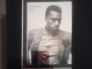
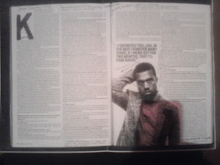
(From Vibe Magazine, February 2009 issue)
WHAT THE MAGAZINE DID:
- Traditional Style of Interviewing: It is the most typical way of writing an article, using the Question & Answering style. This makes it easier for the audience to read because if they are not interested reading the whole article, they can look for question they are insterested in and read it without the hassle of reading the whole article to find what you want.
- Colloquialisms: Uses of words that Kanye said like "wanna" forms idenfication with audience as most of the target audience do not talk in standard english.
- Floating Quotes: Used to interest the audience and persuade them to read the rest of the article.
- Open Questions: Used to allow the audience know more about the artist.
- Main Image: Relates to the article as they are talking about his lastest album 808s & Heartbreaks which is connoted through his costume in the main image. He is wearing a heart on his blazer to symbolise love but also has a confused facial expression which could be the effect of love or heartbreak.
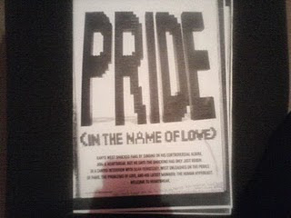
- Brand Identity: The "K" at the beginning of the article relates to Kanye West himself as he uses this type of font in his albums etc. Alongside this, his album is different from his other albums as he has changed his sound. He had become more techno in the beats he uses which is connoted through the jaggered edges that looks funky and upbeat.
What I have learnt through analysing this article is that everything links (Main Image, Font of first letter, the article) to the general theme or message that is trying to be portrayed. When I do my main article, I have to make sure that the pictures I use relate to the topic I am discussing.
When I write my article I have to revise and research different writing styles to make sure my article is up to the standard of a real magazines.
Here I have continued creating my contents page. I have made a few changes in terms of the layout. I have removed the yellow box that said Extras and changed it to regulars. Also, I moved all the subheading and articles on one side. I feel the removal of the yellow box and moving the articles on one side makes the layout of the contents page look neat. Overall, I kept the other features the same.
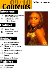

All that needs to be done now is the editiors invoice of my magazine.
Friday, 19 March 2010

>> Here I began creating my contents page. As a group we decided to go for a simple layout due to the characteristics of our target audience. They are more organised and sophisticated which is refelcted in the layout. We still kept the theme of mustard yellow, black and white in order to promote brand identity which is important as if our target audience see these colours they are immediate asssociations with smooth magazine. As you can see we have started to put the articles and page numbers under subheadings which enables our target audience to find relevent articles easily.

Here is a continuation of creating the contents page. Here I have started to organise where things need to go and thinking of improvements that needs to made. Generally I like the box which states its a contents page and the date as it clearly addresses what the page is about. However I feel that the subheadings being bigger than the article copy isn't enough to make it stand out and direct the consumer to the desired article therefore it will need to be changed. Lastly, I need to change the size of the copy (the articles) to make it smaller because if I don't there won't be enough room for additional images.

As a group, we discussed the issues we had regarding the contents page and made successful changes. One of the main issues was the fact that the subheading weren't standing out as much as they should be. We resolved this by putting a black box around it and changing the font to white instead of black. By deciding to do this, makes it stand out as the typography is in white which differs the typography of the article which is in black, making to eye-catching which is reinforced by the box around it whilst still keeping the colour scheme of the magazine.
Also we decided to change the page numbers into mustard yellow in order to make it easier for the consumer to differentiate the page numbers from the articles but also to make the aricles stand out more than the page numbers. This also makes the articles more accessible to the consumer as there is less emphasise on the page numbers but are still can be read.
I made the typography smaller to fit in more copy and make space for additional images.
Lastly, the heading the was before called "Extras" is now called "Regulars". This name for the heading made more sense than extras as the articles that will come under this heading will be expected to be in the magazine regularly and be in every edition of the magazine.
Generally, I feel the contents page is improving but there still may be some improvements needed again. I am mainly concerned about the lack of space there is for the additonal imagery that will be included on the contents page so i will have to continue to resize, move and delete aspects of the magazine.
Tuesday, 16 March 2010
PLAN OF THE CONTENTS PAGE.

Here is the plan for my contents page. I have inlcuded things that should be included on a contents page like imagery, the date, contents and the editors message. As a group we decided on four subheadings (Interviews, Features,Reviews and Regulars) which will be placed on the left hand side of the page. Where orginally we had too many subheadings like Live and Gigs that we removed and decided to converge into other subheadings.
Wednesday, 10 March 2010
The Functions of Contents Pages:

VIBE- *Plain- Lack of Colour
* Subverts music magazine conventions. E.G. the image dominates the page whilst the copy is very little.
* The front cover in the contents page
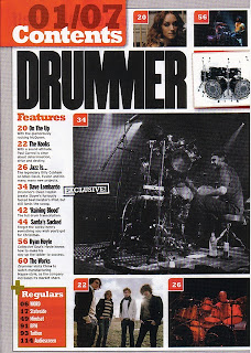
DRUMMER: *Main contents features are linked to the main images.
*Effective use of typography-connotes instruments and music.
* Main feature Image- dominates page and conveys magazine genres.
* Organised Layout- Sophisicated-subverts rock conventions which widens target audience appeal.
NME- *Use of synopsis- Informs readers and gives more detail.
* SubHeadings- organised easy to find what you want to read.
*Main Image- tribute
*Additional Images of back copy
* Colour Scheme- Good Brand Identity
KERRANG!- *Quote placed beneth Contents- Long informal and relates to it audience but also challenges audiences perceptions.
*Bold Typography
*Colour Scheme (black,yellow and white) promotes brand identity
*Red-subverses design of the contents page to convey power
*Live Performance Images- adds authenticity
REJECTED PHOTOS:


Here are some of the photos I rejected from being on the front cover of my magazine. I have rejected these photos for various reasons but mainly because it was either blurry or I didn't like the pose.
 This is the photo I am going to use for my front cover. I feel this picture embodies the feature artist I wish to depict. Also I feel it connotes soul through the tribal patterned dressed I requested my model wear. There are inperfections with the photo such as the red in the bottom right-hand side corner that can be resolved in photoshop by either cropping the photo or colouring it in the same colour as the background with the paintbrush tool.
FRONT COVER:
Tuesday, 9 March 2010

These are photos that I rejected due to simple problems such as the facial expressions not being right, it being over-exposed and it being blurry.
FRONT COVER:
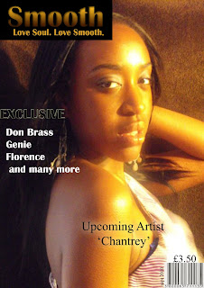
This is my front cover. After making this I wasn't completly happy therefore I am going to change the main image as it is over-exposed and couldn't be fixed in photoshop,wardrobe malfunctions and I feel the dress that i made my model wear does convey the soul genre. When I re-take the photo I will keep the background brown but instead make my model wear a tribal pattened dress and try to incorporate more browns in the outfit. I will keep the barcode and the price in the same place and keep the same typography for the coverlines and main coverline therefore I will change the font of 'Upcoming Artist "Chantrey" to Britannic Bold.
As a group we looked at the masthead again and decided to remove the box from around the masthead as we felt that it is to over powering. Also we decided to add a strip at the top of the magazine saying 'Number one source for SOUL!' to avoid the magazine looking plain but also to promote it and have it as an extra puff.


