Friday, 26 February 2010

CREATING THE MASTHEAD:

In order to create the masthead, I first have to choose the typography that the name of the magazine should be in.
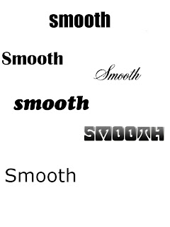


Here, I have created a range of fonts with the name smooth to help me decide what typography I should use for my masthead. I have decided to use the font second down to the left-hand side as I feel it connotes the word "Smooth" the best. Alongside this, I will be using the gradient effect that I used on one of the fonts to create the masthead.


FIRST MASTHEAD ATTEMPT:


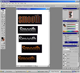
This was the outcome of my first attempt of making the masthead. This won't be used as a masthead on the magazine as I don't feel it relates to Soul mainly becuase of the typography is too bold and instead the name of the magazine will be written in one capital letter and the rest in lower case. Also the colour of the typography doesn't suit the soul genre therefore I will be changing the colour and the effects. I will be keeping the box around the typography as it makes the masthead stand out but instead of making it black and purple I will be changing it to just black.


Here I have tested different colours against a black background to see what colour compliments the black background but also connotes soul. In the end I decided to use the colour and effect of the 4th masthead design.


Here I am starting to finalize the masthead. I like everything that I have changed all I wants to do is swap the effect used on the puff with the masthead as I feel the masthead needs to stand out more than the puff as it is the name of the magzine.


FINAL MASTHEAD:
PLAN FOR FRONT COVER:


In this plan I have encorporated things that are generic of a mucic magazine such as a masthead(Smooth) and a puff (Love Soul. Love Smooth). Also, I have coverlines of exclusive interviews with other artist. This will attract my audience as they will feel they can only read these interviews in only "Smooth Magazine" and no other through the word "Exclusive". I have made the price of my magazine

£3.50 because of the results of my questionnaire. Moreover, I have made my main coverline about an interview with an upcoming artist as most people from the questionnaire said that they like to read about upcoming artist and interviews therefore I have combined both together.

Sunday, 21 February 2010

Here I have recorded a selection of people I have interviewed to give an insight of what a music magazine should include in the opinion of the audience.

Saturday, 20 February 2010

FINDINGS FROM QUESTIONNAIRE:
By conducting this questionnaire it enabled me to find out about my target audience in terms of what features they want in a music magazine.


This table shows that Hip Hop and R'n'B is the most popular genres amongst my participants. The majority of participants which choosen this were aged 16-19. From this age bracket one person choose an "other" genre of electropop as a genre they listen to.For my Soul Music target audience I am aiming to target those 25 or older. The findings from this question supports this as all 3 of the participants who choose soul as a genre they like were all 20 and older. These 5 people of this age bracket also choose an "Other" as Gospel music they also listen to which is similar to Soul as a genre they also enjoy.


This table represents how much people are willing to pay for a music magazine. I shows that those under the age of 19 and only willing to pay between £1 and £2. It also shows that my target audiences are willing to pay a higher price. 45% of them would pay £1 and £2 but 55% are willing to pay between £2 and £5. A majority suggested £2 to £3 whilst one wanted to pay £4 to £5 therefore I have decided to price the magazine as £3.50.


From this question it tells me, that most people read magzines on the internet aswell (55% of people said they did) therefore I will include a website address on the front cover of my magzine.


Question 9 of my questionnaire was "What features would you like to see in a music magazine?"
The three popular answers of the magazine was Interviews, Articles on Upcoming Artist and information about Concerts. 43.75% of the participants chose Interviews and 31.25% chose Upcoming Artist as a features that they will like to see in a music magazine because of these figures I have decided to make my main article about an interview with an upcoming artist which is a combination of both of the popular features people would like to see in a music magazine as I feel it would be successful.


From these responses it tells me that the older audience (my target audience) are less likely to enter compettions and it is more appealing to a younger audience therefore I will not be mentioning competitions on my front cover as an incentive.

Friday, 19 February 2010

AUDIENCE ANAYLISIS:


In order to understand the wants and needs of my
target audience in terms of what they want
in a music magazine, I have produced a questionnaire which 20 people filled out. There were six people who are sixteen or under, one person who was seventeen, one person who was eighteen, two people who was nineteen and nine people who are twenty or older.

THE QUESTIONNAIRE:

1. How old are you?

16 and under

17

18

19

20 or older


2. What type of music are you interested in?

(Please circle as many that applies to you)

Hip Hop

R’n’B

Rock

Heavy Metal

Dance

Pop

Soul

Other- please state:_____________

3. What do you do in your spare time?

(Please circle as many that applies to you)

Raving/Partying

Sports

Shopping

Cinema

Other-please state:_________________

4. How much are you willing to spend on a music magazine?

(Please circle one)

£1-2

£2-3

£4-5

Other-please state:___________________

5. What type of freebies would you like to come with the magazine?

Mixtape

Posters

Headphones

Other-please state:_____________

6. What music magazine have you previously brought?

(please circle as many as applies)

Vibe

NME

Mojo

None

Other-please state:______________

7. Do you read magazines on the internet?

Yes

No

8. What features would you like to see in a music magazine?

(please circle as many as applies)

Interviews

Reviews

Upcoming

Artists

Concerts

Events

Other-please state:_________________

9. Would you take part in any competitons?

Yes

No

10. Do you ever attend concerts?

Yes

No

Rarely

Occasionally

Frequently

Thursday, 18 February 2010


ANALYSING FRONT PAGES:

The hip hop magazine I will be analysing is XXL. In terms of presentational devices the magazine consists of a masthead, puff, coverlines , a main coverline and a main image.

The masthead (XXL) is written in capitals filled with diamonte. This has associations with wealth and bling in the hip hop culture. This is reinforced by the main image of Lil Wayne and Baby who are rappers wearing multiple chains (bling). This folloes the stereotypical representation of rappers and hip hop which gratifies it’s audience as it meets their expectations.

The main image of Baby and Lil Wayne is an effective presentational device. The fact that they are both topless signifies courage and them being tough, real men through the tattoo’s they have (which also coveys wealth) as most people may feel vulnerable or sevobject, if asked to be photographed topless. This aspect of the main image meets the generic codes and conventions of hip-hop and a hip-hop magazine whereas the camaraderie within the main image opposes it. The fact that Baby has his arm around Lil Wayne as if he is hugging him coveys support for each other and protection which subverts black male characteristics but also the typical hip hop representations.

The coverlines of the magazine lists various music artists which show different artists that will be included in the magazine. This persuades consumers to purchase the magazine if they aren’t necessarily interested in the artists in the main image, they may be interested in one artist included in the coverline therefore purchasing the magazine which gratifies its targeted audience.

The background is also significant. The background image depicts a house which seems quite rough signified by the wood it was made of. This suggests the area which Baby and/or Lil Wayne grew up in. This connotes that they never get were they come from and they are true to themselves which subverts the representation perceived by them wearing a lot of chains.

Lastly, the puff included in the magazine persuades audiences to purchase the magazine. One of the puffs “A decade of dominance” includes alliteration which makes it memorable and stays in the consumers mind. Also, the use of the word “dominance” makes it seem as if XXL is the best selling hip-hop magazine which is reinforced by another puff “10th Anniversary” which connotes how long they have been selling for.

In conclusion, some aspects of the magazine conveys generic codes and conventions of a hip-hop magazine which includes the masthead and the main image which I think makes this text successful in targeting it’s audience. Also, parts of the magazine challenges dominant ideologies of hip hop which I feel attracts its targeted audience but also other audiences as it creates different ideas about hip-hop-i.e. The fact that Baby’s arm is around Lil Wayne creates positivity about hip-hop which shadows the negative stereotypes associated with hip hop through people’s perceptions.


Wednesday, 17 February 2010

ANALYSING AND COMPARING FRONT COVERS: (NME AND Q MAGAZINE)


Both Q and NME magazine share similarities in the use of presentational devices. The mastheads in both magazines are red and white which makes the name of the magazine stand out whilst allowing the audience to know the name of the magazine easily but also makes it recognisable. Furthermore, both magazines include additional imagery which highlights what else will be included in the magazine.

In addition Q utilises a main image of music artists. This is eye-catching as it is centre-frame and is the biggest item on the magazine which is gratifies the target audience as if the people on the magazine are recognisable they are more likely to buy the magazine. Also, if the audience are able to identify with the main image, they are also more likely to purchase it. This is the same with NME magazine as the main image on the front page is of a teenage male group which grabs the attention of the target audience which increases the possibility of them buying the magazine alongside the gratification of being able to identify with the magazine.

The coverlines on the magazine is similar in both magazines. Both magazines use bold colours and typography on the front cover which grabs the audiences attention but also the coverlines highlight what else will be included in the magazine and increases arousal. On Q magazine, “Pete Doherty-Kate Hates my Music!” and NME’s “James Brown R.I.P” does this. In addition, it increases arousal as it creates questions in the audiences’ mind like Why? When? Which raises the desire to answer questions they have therefore purchasing the magazine.


Alongside the similarities there are differences between the two texts. The main difference is who the magazine is targeted at. Q magazine is targeted at a more sophisticated audience aged 25 up. This is depicted through the feature image and coverlines of the interviews they have conducted and turned into articles. For example, James Blunt’s music is normally associated with an older audience. Whereas NME is targeted at a more youthful audience aged 14-25 which is evident through elements of the front cover. The tie-ins of the magazine highlights this. NME offers posters which is normally associated with teenagers as they use it to decorate their bedrooms with posters.

Each of the magazines has its own brand identity. This is clearly evident in the NME magazine. I think NME is successful in targeting its audience and conveying the rock genre through its use of typography and colour. First of all, all the text is in capital letters which relates to the rock genre as it is characteristically bold and loud which is what the typography represents. This differs from Q as it uses a mixture of cases on the front page. There are other elements that convey NME magazine’s genre. On the main coverline there is a flame on one of the letters that connotes the dangerous and rebellious behaviours associated with rock music which is reinforced by the yellow that is around the coverlines and tie-ins which looks very electric and lively which again is related to rock music.

The brand identity of Q differs from NME. Q magazine is generic which is evident through the white background. Q has no particular genre and is varied therefore there isn’t much elements which connotes a specific genre as NME does.

In conclusion, there are many similarities and differences between the two magazines.


As a group we decided that the name of the magazine will be "Smooth Magazine". This has connotations of being relaxed and sleek which is also associated with soul music. The puff for the magazine will be "Love Soul. Love Smooth." I feel it is rememberable through the use of short sentences and the repetition of the word "Love" which helps the puff stay in the audiences' mind therefore also remembering the magazine.
I feel the name "Smooth" is most suited for a Soul magazine then the other names that were generated. The names we thought of like "Divine" and "Spirit" seemed too feminine therefore eliminating part of our audience as the magazine is targeted at both genders. Also other names such as "Vitality", "Essence" and "Essential" had connotations of female health and fitness magazines rather than Soul Music.
For my As Level foundation profolio (coursework), I will be creating a music magazine which consists of a front cover, content page and two-page sprend article. In order to create it I will be working as part of a group of three where we will each make our own issue of our magazine.


PLANNING: