Thursday, 15 April 2010
Message about magazine
Anita, when I marked your magazine, when you click to enlarge the pages, the images are pixelated. Please look into this and delete them and upload them again as I know that having seen your work in school, this is a technical problem. Come to the CLC on Monday if you are still experiencing problems with this.

Sunday, 11 April 2010


Saturday, 10 April 2010


Friday, 9 April 2010
Message from Ms Prince
Your blog has now been marked for research and planning. Anything that you may now add will not be counted towards your final mark.
Magazine and Preliminary Task
Well done for meeeting the deadline Anita. Your work is very promising. Please upload all 4 magazine pages AND your preliminary tasks so that they can be viewed as full A4 size. I can then proceed with marking the magazine.
Monday, 5 April 2010

LOOKING BACK AT YOUR PRELIMINARY TASK, WHAT DO YOU FEEL YOU HAVE LEARNT IN THE PROGRESSION FROM IT TO THE FULL PRODUCT?


THE PRELIMINARY TASK- This was done before I started producing the music magazine in order to learn how use things in photoshop and practise on how a magazine should be put together and what it should look like. This magazine is a school magazine with a contents page aswell.
THE PLAN FOR THE PRELIMINARY TASK- As when I produced the music magazine, I had to make a sketched plan for what I wanted on the front cover for the preliminary task magazine front cover before I could start the production process.

MY MUSIC MAGAZINE

When comparing my music magazine to my preliminary task, It is evident that I have progressed.
- I feel I have improved on my composition. In the preliminary task all my copy was on one side on the front cover and quite swashed therefore making it look less like a magazine but in the music magazine I learnt from my mistakes and moved the copy around and spaced it so it looks more realistic. Also on my contents page the composition is more organised in the music magazine as I have the copy on one side and the imagery on the other whereas in the preliminary task I only had to columns of writing and no imagery which isn't typical of a magazine contents page.
- The colour scheme on my music magazine shows I have progressed from the preliminary task. The colour scheme on my music magazine (black, gold, white and brown) all compliment each other and connote the luxury of Smooth Magazine. Whereas on my preliminary task I used the colours purple and green which is rather unflattering but do connote the Preson Manor school colours.
- In terms of the effects that I used, I feel I have progressed. The Masthead itself is evidence of progression. The effects I used on the masthead shows my ability to use photoshop to make typography look professional and like a real magazine. Also I have learn how to make the typography stand out. On my music magazine, I used various effects like outer-glow to make the main coverline stand out. Before I couldn't achieve this on the preliminary task which is evident through the coverlines blending in with the top the model is wearing.
- For my music magazine I have included more pages to make it look like a real magazine whereas in the school magazine there are only just over 11 pages making it look unauthentic.
Sunday, 4 April 2010


HOW DOES YOUR MEDIA PRODUCT REPRESENT PARTICULAR SOCIAL GROUPS?
PSYCHOGRAPHICS: This is when the market is segmented based on people's personalities.
After analysing all the different segements caterogies that audiences can fit into (Mainstreamers, Aspirers, Succeeders, Individualist and Carers) I have decided that the personality of my target audience fits into the Succeeders segment.
PSYCHOGRAPHICS: This is when the market is segmented based on people's personalities.
After analysing all the different segements caterogies that audiences can fit into (Mainstreamers, Aspirers, Succeeders, Individualist and Carers) I have decided that the personality of my target audience fits into the Succeeders segment.
SUCCEEDERS: Are those who are successful and self-confident. They have money and the life but don't need to show it off. They tend not to buy aspirational products and follow their own ideas on what product is good without having to be heavily influenced.
HOW DID YOU ATTRACT/ADDRESS YOUR AUDIENCE?
There are many ways in which my magazine attracts and addresses my audience.
There are many ways in which my magazine attracts and addresses my audience.
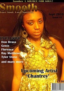
- The use of superlatives attracts my audience. By putting a banner on my front cover saying "Number 1 source for soul" gives the impression that my magazine is the best magazine for soul music. Also this is a short sentence which helps stay in the consumers mind. This is futher reinforced by my puff-"Love Soul. Love Smooth" which gives the same impression.
- The use of the word "Exclusive" on my front cover listed with different artists that have been interviewed underneath it, attracts my audience as it suggests that it will be the only magazine with those artist interviews in it, therefore they won't find it anywhere else which persuades them to buy the magazine especially if an artist they are interested in are included in the magazine.
- The main image on my front cover reflects some of my target audience which will attract and address them through identification and envy. Some people may identify with the artist on the front cover because of her age and others may envy her and lifestyle and want to find out more therefore purchasing the magazine.
- The use of Direct Address attracts and addresses my audience. As the model is looking directly into the camera, it communicates with them alongside catching their eye when on the newstand in shops.
Sunday, 28 March 2010
WHAT KIND OF MEDIA INSTITUTION MIGHT DISTRUBTE YOUR MEDIA PRODUCT AND WHY?
The media institution I might let distrubte my media product is GMG. (Guardian Media Group plc). This insitution has vast amounts of subsituaries which include magzine, radio and newspapers like the guardian and the Observer. I would choose this insititution to distrubte my media product because of their experience marketing to niche audiences. I have a media product that caters to a niche market. Through radio stations that GMG own like Smooth Radio and Jazz FM( which my audience will listen to) and newspapers they read like broadsheet newspapers like the Guardian instead of tabloids newspapers like The Sun and News of the World. The audience would already know this company and would make the link that if their radio stations and newspapers which they consume are good then these positive connotations will be linked to my magazine. Also, my magazine fits into GMG product portflio. As GMG generally have products that my target audience are interested in; they would know how to promote my product as they have the same market segment and do it successfully. For this reason is mainly why I choose GMG as the media insititution to distrubte my product instead of one of the bigger, well known publications like IPC because they may not know how to target my segment successfully especially as it is a market niche and they cater for mainstream audiences.
The media institution I might let distrubte my media product is GMG. (Guardian Media Group plc). This insitution has vast amounts of subsituaries which include magzine, radio and newspapers like the guardian and the Observer. I would choose this insititution to distrubte my media product because of their experience marketing to niche audiences. I have a media product that caters to a niche market. Through radio stations that GMG own like Smooth Radio and Jazz FM( which my audience will listen to) and newspapers they read like broadsheet newspapers like the Guardian instead of tabloids newspapers like The Sun and News of the World. The audience would already know this company and would make the link that if their radio stations and newspapers which they consume are good then these positive connotations will be linked to my magazine. Also, my magazine fits into GMG product portflio. As GMG generally have products that my target audience are interested in; they would know how to promote my product as they have the same market segment and do it successfully. For this reason is mainly why I choose GMG as the media insititution to distrubte my product instead of one of the bigger, well known publications like IPC because they may not know how to target my segment successfully especially as it is a market niche and they cater for mainstream audiences.
AUDIENCE FEEDBACK
I order to know how successful my magazine is I have asked people of their opinion of the magazine as a whole.
PERSON 1: With this person's feedback, I bullet pointed topics that she could discuss in order to prompt her and get her started. These bulletpoint topics included:
I order to know how successful my magazine is I have asked people of their opinion of the magazine as a whole.
PERSON 1: With this person's feedback, I bullet pointed topics that she could discuss in order to prompt her and get her started. These bulletpoint topics included:
- The colour scheme
- The Layout
- How the genre is conveyed
PERSON 2: This person I never prompted as she didn't need to and she talked freely.
REJECTED PHOTOS FROM MAKING THE MAGAZINE
C:\Fakepath\Rejected Photos
View more presentations from anitaboateng93.


Here i have made the final changes to my article.

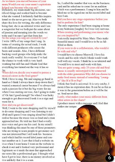

Before I had suggested not to put a title on my double page spread but I have changed my mind in order to conform with other double-page spread stereotype. I realised that if i dont put a title on my double page spread then the audience may become confused about what they are reading even though it is stated on the contents page. The title "This is chantrey" is on the top right-hand side of the first page of the double page spread so the audience can confirm they are reading the right article.




Friday, 26 March 2010
CREATING THE MAIN ARTICLE:
Now I have done the article for my magazine. I can begin to concertrate on the layout of the magazine to make it look like a real magazine.
On my double page spread there is no title but this is because on the previous page there will be a title saying "The dream starts now" on it with a summary which is similar to the Vibe magazine article that I analysed. By doing this there will be more space for copy and addtional imagery on the double page spread but also provides intertextuality by making a link between the pages/continuity throughout the article.
Now I have done the article for my magazine. I can begin to concertrate on the layout of the magazine to make it look like a real magazine.
CREATING THE MAIN ARTICLE
View more presentations from anitaboateng93.
On my double page spread there is no title but this is because on the previous page there will be a title saying "The dream starts now" on it with a summary which is similar to the Vibe magazine article that I analysed. By doing this there will be more space for copy and addtional imagery on the double page spread but also provides intertextuality by making a link between the pages/continuity throughout the article.
MUSIC MAGAZINE- DOUBLE PAGE SPREAD PLAN.
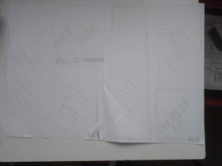
Here is the layout plan for my double page spread. I have included conventions that make it an article like floating quotes and additional imagery. For this layout, I have used the vibe magazine double page spread as an inspiration but made it more simplistic; keeping with the style and characteristics of Smooth Magazine.

Here is the layout plan for my double page spread. I have included conventions that make it an article like floating quotes and additional imagery. For this layout, I have used the vibe magazine double page spread as an inspiration but made it more simplistic; keeping with the style and characteristics of Smooth Magazine.
Subscribe to:
Posts (Atom)