FIRST ATTEMPT OF MAKING THE FRONT COVER:
This is the picture I decided to use to for my main image on my front cover. She represents my main coverline (Upcoming Artist 'Chantrey'). As the picture is over exposed i.e. on the face and arms I will try to mend it on photoshop to make it look more professional.

These are photos that I rejected due to simple problems such as the facial expressions not being right, it being over-exposed and it being blurry.
FRONT COVER: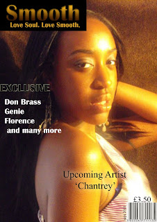
This is my front cover. After making this I wasn't completly happy therefore I am going to change the main image as it is over-exposed and couldn't be fixed in photoshop,wardrobe malfunctions and I feel the dress that i made my model wear does convey the soul genre. When I re-take the photo I will keep the background brown but instead make my model wear a tribal pattened dress and try to incorporate more browns in the outfit. I will keep the barcode and the price in the same place and keep the same typography for the coverlines and main coverline therefore I will change the font of 'Upcoming Artist "Chantrey" to Britannic Bold.
As a group we looked at the masthead again and decided to remove the box from around the masthead as we felt that it is to over powering. Also we decided to add a strip at the top of the magazine saying 'Number one source for SOUL!' to avoid the magazine looking plain but also to promote it and have it as an extra puff.


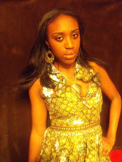 This is the photo I am going to use for my front cover. I feel this picture embodies the feature artist I wish to depict. Also I feel it connotes soul through the tribal patterned dressed I requested my model wear. There are inperfections with the photo such as the red in the bottom right-hand side corner that can be resolved in photoshop by either cropping the photo or colouring it in the same colour as the background with the paintbrush tool.


